Content Sections
Rob Verkerk PhD, founder, executive and scientific director, ANH-Intl
In the minds of many, the value of mathematical models in our everyday lives may have been tarnished forever. That’s assuming you believe that the models used by Prof Neil Ferguson at Imperial College London (my own academic almer mater for a decade) to justify lockdowns have over-estimated the threat of Covid-19 to health. Or they should not have been blindly followed by governments when they never even tried to factor in the scale of collateral damage that the lockdowns would cause indirectly to health, to livelihoods or to economies.
We are told over and over again by our governments that their decisions are being driven by science. If there is one thing we can be sure of, they're not talking about good science. That is because the science around a brand new disease is an incredibly long way from being settled, and all the normal safeguards that try to objectify science such as the peer review process have largely been side-lined in the rush to publish papers on Covid-19. We also now all inhabit a world where objective, independent scientific research has never been so deeply distorted by vested interests.
-
Find related articles, information and videos in our Covid Zone
To provide a few insights into this extreme uncertainty that affects nearly everyone of us to the core, I will discuss below three different kinds of numbers that are being sold to us as if they were immoveable facts – truths even – based on robust scientific consensus.
Misleading numbers #1: Ferguson’s model outputs
The mathematical model that Ferguson and colleagues used to inform the UK and US lockdowns couldn’t come close to representing a real system. It relies on the same base code as the previously criticised models that mis-estimated the impact of foot-and-mouth disease in 2001 (resulting in the unnecessary cull of 6 million cattle, sheep and pigs) and massively over-estimated the impact of avian influenza in 2005 and swine flu in 2009/10.
Where to start? Ferguson’s Covid-19 model didn’t factor in environmental factors that are known to be critical, because next-to-nothing was known about how temperature and humidity might affect transmission, indoors or outdoors – although it’s known to be very important with all respiratory viruses. They didn’t factor in any variation in how the human immune system would interact with the virus and how this would affect the dynamics of transmission. It assumed only 3 groups of people – those who are entirely susceptible, those who are infected, and those who either recover or die. Ferguson and colleagues assumed no ability to affect mortality through appropriate treatment in critical care, or different qualities of treatment in different centres or countries they studied. They certainly knew very little about how different governments, industries and social groups would react if lockdowns were accepted.
It was Ferguson’s group, the Imperial College COVID-19 Response Team, through one of its non-peer reviewed reports (dated 16 March) that suggested 510,000 Brits and 2.2 million Americans would die if no lockdown occurred. This report is widely credited with initiating global lockdowns and that’s how,courtesy of the British tabloids, Ferguson acquired the name ‘Professor Lockdown’. In a subsequent report (dated 30 March) advice was given to 10 other European countries, as well as the UK.
This was instrumental in feeding into the World Health Organization's (WHO) advice to its 150 member countries around the world.
Governments might have been especially cautious given Ferguson’s history with over-estimates. The irony of ‘Professor Lockdown’s’ resignation from the UK government’s key advisory group because he’s had to admit to breaking social distancing rules to meet his married lover isn’t lost on us. The disgrace merited a new name from the tabloids; the 'Bonking Boffin'.
It’s of course not mathematical modelling itself that's at fault. It’s down to what assumptions underpin the model, which ones are ignored or not factored in, and then which data are selected, estimated or invented to feed into it. Modelling studies have been used for over 50 years to help us better understand the function of a whole variety of complex systems, whether natural or artificial ones, in fields as diverse as environmental, agricultural, engineering, social and political sciences. They can be very helpful when built and used appropriately.
In a world in which scientific research is so heavily distorted by funding sources, it’s also crucial to know the funding sources. Any check of Neil Ferguson’s papers in PubMed (example 1, example 2, example 3), will reveal a long-standing pattern of funding by the Bill and Melinda Gates Foundation. Gates also appears to be the second biggest donor to Imperial College after the Wellcome Trust, having gifted $185 million since 2006 (based on preliminary data collated by Dr Vipul Naik).
It doesn't stop there. The Gates Foundation happens to be the second largest funder of the World Health Organization, sandwiched between the biggest donor (the USA, currently withholding payment) and the UK. No surprises that the Gates Foundation even pays media groups, such as The Guardian newspaper, to make sure its messages are communicated to what are considered influential, target audiences.
One particularly devastating deconstruction of the deficiencies of the Imperial College model that’s just been published on the Lockdown Sceptics website comes from an ex-Google, senior software engineer by the name of Sue Denim. Denim concludes, “All papers based on this code should be retracted immediately. Imperial’s modelling efforts should be reset with a new team that isn’t under Professor Ferguson, and which has a commitment to replicable results with published code from day one.”
Yet, perversely, the public gets blamed for being ignorant if it questions the advice of Gates funded institutions, given genuine and justifiable concerns over the independence and quality of the work and advice stemming from it.
Misleading numbers #2: R numbers
When it was discovered that SARS-CoV-2 had the potential to go pandemic in February, there wasn’t much in the way of empirical data to put into models. There were limited data from China, but no one was quite sure whether or not to trust them, Ferguson included. And given we’re talking here about the basic reproduction number – or R number (the number of people one person is likely to infect) – we knew that if it exceeded 2 with people going about their normal business (as it appeared to even by the end of January), the virus had the transmission potential to go exponential – like many other pathogens.
But potential is one thing - actuality is another. Like the population dynamics of most animals, predators and pathogens in most systems, that generally doesn’t happen. Checks and balances get in the way. Much the same reason a pair of houseflies, that have the reproductive capacity to create sufficient progeny in one year to create a layer across the surface of the Earth one metre deep – don’t actually get close to achieving their reproductive potential.
The world has now become obsessed with this R number that few knew about until a a couple of months ago. Staged lifting of lockdowns, social distancing and related measures will be based on the behaviour of this number. We’re meant to simply accept this, it seems. Complete lockdown in the UK is currently predicted to have reduced the Rt value from around 2.5 to 3 before lockdown to the current Imperial College estimated level of 0.7 that was apparently hit on 23 March.
The Financial Times reminds us that the “R number…..will determine when lockdown lifts”. Let’s remind ourselves of this folly by looking again at the MicrobeScope (that we also took a screen grab from when we started our weekly discourse on Covid in March).
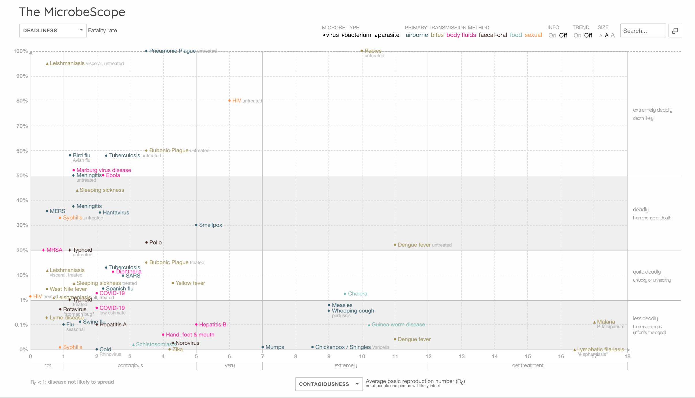
MicrobeScope: comparing contagiousness (R number) with deadliness. Source: Information is Beautiful (screengrab: 7 May 2020)
If measles and whooping cough have R numbers of 9, why don’t we lockdown for them? Because we have vaccines for these diseases? Well, dengue has an R number of 11…what about that, and it doesn’t have a vaccine. Ah…. it doesn’t affect people in rich countries, and they are anyway working on a vaccine for it. If you hadn’t guessed, Gates is funding it.
The point is, you can’t look at an R number without at the very least considering its capacity to harm or kill (deadliness) (as per the MicrobeScope graphic above). And what is the evidence base for your R number when you have such limited capacity to determine the extent of past infection in different populations, given the limitations or availability (including massive geographic variation) of accurate antigen and antibody testing?
What about the measure of deadliness? That’s obviously based on case rate fatality, but what’s your denominator? Is it the people thought, known or suspected to be infected? Or is it the whole population in a country or city when you don’t know infection rates? Ferguson’s team, publishing in The Lancet Infectious Diseases puts the case fatality ratio at 1.4%. But this is data again from a model, not real life – and it's based on data from 24 deaths (yes, just 24!) in Mainland China. The paper also reports between 8 to 28% mortality rate for hospitalised patients in China. One wonders if Prof Ferguson hesitates to think why the mortality data coming out of UK hospitals has been consistently hovering around 50% since the start of the pandemic, as reported by ICNARC (latest report 1 May; 49% dead at end of critical care, 51% discharged).
[Updated 12 May 2020] Another potentially misleading element of looking blindly at the R number may be an effect described in statistics as Simpson's paradox. This paradox suggests that an effect that is noticed when you look at individual sets of data can be lost when you look at the data as whole - in aggregated form. In an enlightening article by Tom Chivers in UnHerd, Prof John Edmunds from the London Hospital for Tropical Medicine suggests Simpson's paradox may be at work when we see an upward shift in the R number that is influenced by a separate epidemic in care homes and hospitals despite a reduction in transmission rates in the community caused by lockdown. The increase in R number might seem like things are getting worse in the community at large, when this is not the case. It would therefore be wrong to reimpose lockdown for the whole community when this subset of data did not contribute to the increase in R.
What about the numerator (the number who’ve died)? Is it appropriate to use reported Covid-19 deaths collated by governments when methods of recording these deaths are fuzzy to say the least (e.g. CDC protocol), they vary greatly between countries and regions, and, in some countries such as the USA, doctors are financially incentivised to classify deaths of those found or suspected to be linked to Covid-19 as deaths caused by the coronavirus?
It is remarkable in our view that throughout this pandemic, in terms of what has been learned about the disease and how to manage it in critical care, NHS doctors as a whole (on average) have not been able (allowed?) to save more lives as time has progressed, with the survival rate in intensive care having around the 50% mark (based on ICNARC reports, most recent; 1 May). This may have something to do with large variations in outcome between different critical care facilities as well as the relatively high proportion of patients that are put on mechanical ventilators. As of 1 May: 70% of all patients (n=5139) were intubated with advanced respiratory support, and of these 62% died. The continued prevalence of use of ventilators is surprising considering how long the scientific community has known that mechanical ventilation seems more likely to contribute to death in the case of Covid-19. Boris Johnson likely owes his life to the NHS doctors who decided to not intubate him.
In short, currently neither for contagiousness nor for deadliness do we have a reliable evidence base. The numbers are as good as fictitious and cannot be determined as fact. Why then do governments act on them as if they were facts?
What if it turns out, as some research suggests, that very large numbers of people have already been infected, most asymptomatically? The R numbers would have to be adjusted upward. Would that make things worse for all of us? No, it would change nothing if we found the R number was actually 5. Ultimately what makes a difference to us is if we get very sick or die. So a mild, highly contagious disease isn’t a problem. And while it’s a challenge and a burden for hospitals if some people need to be hospitalised, the proportion of lives saved in hospital settings is a strong predictor of deadliness. The fact that this varies so much in different parts of the world draws attention to the great variation in critical care being delivered. There may also be other factors such as differing levels of nutritional status, underlying conditions and even different virulence linked to different SARS-CoV-2 strains.
If you obsess about the R number and use it as your key metric, you then also choose to ignore the considerable body of research of the effect of social distancing on stopping the spread of respiratory viruses. That includes a Cochrane Review of 67 studies published in 2011 that concluded “There was limited evidence that social distancing was effective, especially if related to the risk of exposure.”
Misleading numbers #3: excess deaths
As we’ve said from our first articles on Covid-19 in March, context is everything. The mainstream media don’t seem that interested, presumably because scary numbers sell content and gratify advertisers and donors.
But when we listen to daily death tolls, these are meaningless if we don’t put them into context, because – believe it or not – people die all the time. It’s one of the few facts we can be sure of in this increasingly uncertain world.
As I’ve tried to show above, we have an issue with the quality of many of the numbers being thrown at us around Covid-19. Presently it looks like, in the main, the deaths that are reported by national and global agencies each day, that the media throw out to us on their daily news bulletins, are likely over-estimates as far as Covid-19 being the cause. That’s because deaths of those found or suspected to be related to Covid-19, or where Covid-19 pneumonia may have contributed to deaths that were likely to occur soon, are being treated in most parts of the world as ones caused by Covid-19. The UK Office of National Statistics is clear that Covid-19 deaths it reports are those that simply “mention” Covid-19. This blurring is a misattribution of cause of death.
But let’s just put this misattribution aside for now and treat officially reported deaths as if they were genuinely caused by SARS-CoV-2.
Following is today’s update from the European Centre of Disease Prevention and Control (ECDC).
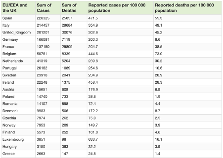
Covid-19 situation update summary table for top 20 EU/EEA and the UK (7 May 2020). Source: ECDC
Taking the UK figure of mortality which has now topped 30,000 as a worse case scenario, adding an additional to 50% to this figure to make 45,000 by the end of year based on the fact the infection wave is largely over, we might generously estimate 68 per 100,000 deaths by the end of the year.
That would put it smack in the lower end of the ball park for a typical bad year of flu and pneumonia deaths that range from around 60 per 100,000 in 2018 to just under 110 per 100,000 in 2001. Neither ‘pandemics’ of avian influenza (A/H5N1) nor ‘swine flu’ (A/H1N1) in 2005 and 2009 respectively caused a marked spike.
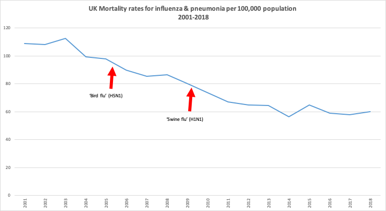
Source: Office for National Statistics
Let’s then look at a larger scale, and consider excess deaths, the number of additional deaths that would normally be expected to occur. Excess mortality data have been collated for the 24 countries that make up the EuroMOMO data sets, these in turn being derived from official national mortality statistics, so they will include the blurred mortality numbers we’ve discussed above. The excess mortality data you see below are usefully stratified for age and show clear spikes linked to Covid-related deaths at present (extreme right side of graphs), but only in the 15 to 64, and the 65+ age categories (note the y-axis scales are different).
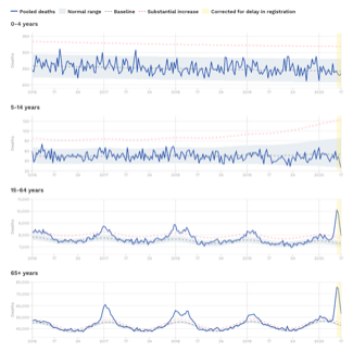
Pooled number of deaths by age group. Source: EuroMOMO
From week 10 of 2020 to the current week 18, there is an excess in deaths across all 24 EuroMOMO countries of almost 150,000 (~80% of which are over 65 years of age). That equates to around an excess mortality that equates to roughly 30 deaths per 100,000 population that represents the EuroMOMO countries' ~500 million population. That’s still within the range for a bad flu season and when that incidence is added to the 2018 influenza and pneumonia deaths in the UK (above), it still doesn’t exceed the deaths from the same causes in 2001.
We will never have the data that will be able to compare what might have happened had we not locked down, and no doubt there will be those who go back to Ferguson’s and others’ dizzying projections.
Any loss of life is always unfortunate, but it makes a great deal of difference to the function of societies and economies if a respiratory virus takes out younger rather than older individuals. This one clearly prefers older, sicker people with less robust or failing immune systems. That makes it even more astonishing that so little emphasis is being placed on improving the immune and related functions among those who are most vulnerable. Shielding these populations is of course critical given their susceptibility.
These figures cannot yet account for the excess mortality that will come about because healthcare systems that were previously already overburdened with slow-killing chronic diseases dispensed of many of these patients to deal with an out-of-the-blue infectious disease. This indirect cost will be something we will have to come to terms with over time – and there will no doubt be many lessons will eventually be learned from the inability of those who took charge and made rash decisions without sufficient due diligence or consideration of context or implications.
-
Our work is only possible with your continued support and kind donations.
Closing remarks
These three sets of numbers that are affecting policy decisions; from models, R numbers and mortality rates, clearly need to be looked at very carefully.
What’s interesting is you don’t need to jiggle and fiddle with them to make them look less scary than the way they are typically portrayed. You just need to see them in context with each other and with other official data – ignoring even that the raw data may be over-estimated or under-estimated to make them look worse than they actually are.
All of this while we ignore what might have happened had we allowed this new virus, with relatively low level contagiousness and deadliness, sweep across the world, causing or contributing to death in a small number as so many diseases do, but building immunity in the vast majority exposed.
Governments are placing a lot of emphasis still on antigen tests to confirm infection. That’s good if you want to attribute Covid-19 as the cause of death simply when someone’s infected with it. But it’s the antibody tests that will really tell us just how much of the population, in different parts of the world, and regions of each country, have quietly built up immunity to SARS-CoV-2. We have to ask ourselves whether some have an agenda that is not intent on prioritising determining the extent of naturally-acquired immunity as this will lessen the perceived value of vaccines.
It was thus determined that we'd be locked indoors and we must listen to Bill Gates telling us that we won’t truly be freed until everyone's been vaccinated (please respond to our call to action).
The rest will become history. And it’s for us to create the future we want, not to be dictated to by those who have an agenda that’s not in the public interest.
IMPORTANT NOTE: Please share widely among your networks given unprecedented censorship and restrictions on freedom of expression.
>>> Go to ANH Intl vaccine transparency manifesto
>>> Go to ANH Intl Covid Zone
>>> Go to ANH Intl homepage





Comments
your voice counts
08 May 2020 at 6:23 am
Hi, I totally agree with you. We in India are blindly following what the UK , USA and other european countries are telling us. we have been intuitively know this is a control game and is been implemented few individuals who have a strategic plan to bring the world under their dictatorship. Our county with all our strength of ayurveda are yet to come out of the shock and learning. We are 20 year young country as of now. With this kind of population having a death toll of 1000 in the entire country with a population of 1.3 billion is not an issue yet, because of the world order, we are under lockdown and lost hugely in our economics etc., you know. it.
If you have any genuine data on India please send me, I will take it up. Already on a campain on NO TO VACCINATION.
Love you
08 May 2020 at 7:36 am
Very interesting - exactly what I have been sending letters to the press and politicians about for weeks, with little effect. The use of the R value by politicians is deplorable. The public has no way of checking the accuracy of their estimates of this mathematical concept. The important figures we should be able to check easily is the number of cases registered each day. But how is this figures arrived at? People who turn up to surgeries and doc diagnoses COVID 19 ? Or only those sent to hospital.? Is it only those who test positive or COVID 19? We know the test is not 100% accurate. Surely it is the symptoms which are the crucial factor in identifying a disease, not the result of a test (whose inventor said it was not suitable for diagnosis). Anyway, the recorded number of cases is fairly stable at around 33,000 per week. People are still getting infected despite this harsh lockdown. That is the all-important statistic. Clearly a main means of transmission is not being tackled, and no effort being made to find it. Therefore the R number cannot be below 1.0. Is the lockdown doing much good? It seems to have reduced the RISE in infection rate, but we just do not know what would have happened without lockdown. We need to halt it to find out.
08 May 2020 at 1:47 pm
Thank you, again, for this enlightening and intelligent article. I rely heavily on organisations like yours for reliable information that has actually been well-considered. I am very worried about what the future looks like after this; I can only hope that more people come to places like ANH International for their information rather than governments and mainstream media.
08 May 2020 at 9:14 pm
I heard that in the US Medicare pays a hospital $13,000 per Covid treatment and $39,000 if the treatment goes to ICU. But I dont think the UK NHS is free from this potential motive for classifying deaths as Covid if at all possible. The greater the apparent strain, the better the chance of securing more funding when this is over
Your voice counts
We welcome your comments and are very interested in your point of view, but we ask that you keep them relevant to the article, that they be civil and without commercial links. All comments are moderated prior to being published. We reserve the right to edit or not publish comments that we consider abusive or offensive.
There is extra content here from a third party provider. You will be unable to see this content unless you agree to allow Content Cookies. Cookie Preferences