
Content Sections
By Melissa Smith, outreach & communications officer and Rob Verkerk PhD, executive & scientific director
Testing rates have shot up and ‘cases’ have inevitably followed suit. Unsurprisingly, governments are now responding by tightening the screws in a bid to reduce community spread of the novel coronavirus.
Equally unsurprisingly, more and more members of the public are realising that case counts based on questionable PCR tests are probably not enough to justify restrictions that destroy livelihoods, economies, mental health – and the rest of it. More useful metrics of the risk posed by the virus are hospitalisation rates, Covid-related deaths and ‘excess deaths’ (excess death rates as compared against 5-year averages). Hospitalisations and deaths still remain low – but is this just lag? The prevailing uncertainty means we’re being taunted by the threat of a repeat of what happened earlier this year.
Who knows?
Scientific advisors to governments appear to be offering randomly picked rocks from a beach to throw at the problems with little or no robust science to support the strategies.
Those who stand up and speak out are dismissed, belittled and smeared. Politicians continue to push the fear agenda, and the bullying and coercion of citizens is on the up. Scientific discourse – both between scientists and by the public – is being shut down on social media. We’re told public non-compliance will end in even in more pain.
Matt Hancock, UK Health Secretary, speaking in Parliament this week, told MPs that delaying action will lead to more non-Covid deaths and economic pain than that caused by the hugely damaging restrictions and lockdowns being imposed.
With all the confusion, mixed messages and differences of opinion, data generated over the coming weeks or months will help make things a little more clear, although if governments move forward with only a single strategy, there will be little prospect of valid comparisons being made across a range of different strategies.
‘Lies, damn lies and statistics’
Data themselves aren’t the end of the story. It depends on how the stats are collected, recorded, interpreted and presented. Governments and the media appear to pick and choose what they want to share to support their political agenda, presumably knowing the majority won’t look at the underlying data in an effort to unpick the bigger picture that underlies the headlines.
Here, we look at three areas that compare different approaches to collecting or presenting data. You can make what you want of it – because, at least for the time being, we have free will.
Mask confusion
First, we were warned that the wearing of masks could cause more harm than good to members of the general public. Jenny Harries, UK deputy chief medical officer said wearing a mask could put people at more risk. Let’s remember at this time the science very clearly suggested that there was no scientific evidence that wearing masks would protect people from respiratory viruses in general community settings.
This view was reflected when Dr Anthony Fauci initially told US citizens not to wear masks and a paper in the prestigious journal The New England Journal of Medicine cemented this by stating mask wearing outside of a hospital setting “…offers little, if any, protection from infection.”
But then, the U-turn: we were next told we should all wear face coverings or masks, because the science had changed. But was the U-turn down to changing science or changing politics?
Shouldn’t we rely on the latest science? So how’s this: a brand new study by the US Centers for Disease Control and Prevention found, in a study of outpatients from 11 healthcare centres, that of those who tested positive and went on to develop Covid symptoms, 71% reported always wearing face coverings or masks (within 14 days of onset of symptoms). This contrasted with just 4% for those who reported never wearing masks, and the same proportion again who reported rarely wearing one. This obviously doesn’t take into account any differences in viral load or exposure, or the ability of a mask-wearer to reduce (or increase) transmission to others.
What’s striking is that the data show that the proportion testing positive was directly and positively associated with the amount of mask wearing and that there were 18 times more Covid symptomatic/positive test people in the “always” wearers versus the “never” wearer groups. It sure puts some questions into the minds of those who might have thought masks were a good thing.
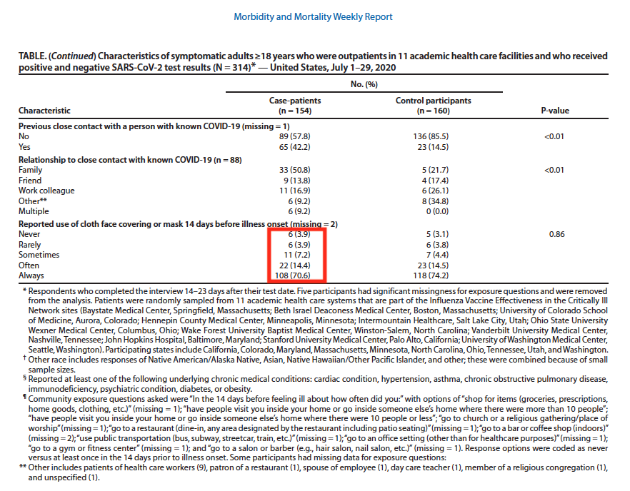
Figure 1. Source: Centers for Disease Control and Prevention, Morbidity and Mortality Weekly Report “Community and Close Contact Exposures Associated with COVID-19 Among Symptomatic Adults ≥18 Years in 11 Outpatient Health Care Facilities — United States, July 2020”
Interestingly, the same relationship with mask-wearing was found with those who tested negative, who also had symptoms, presumably linked to false negatives or other respiratory pathogens. This suggests that SARS-CoV-2 transmission, at least with or without masks, works in much the same way as with other respiratory pathogens – so surely that re-validates the older science that says, don’t bother wearing masks in community settings?
Given that the CDC data suggests that mask wearers may become massive reservoirs of SARS-CoV-2 and other respiratory viruses, are you still persuaded, if you wear a mask, that you'll be protecting others?
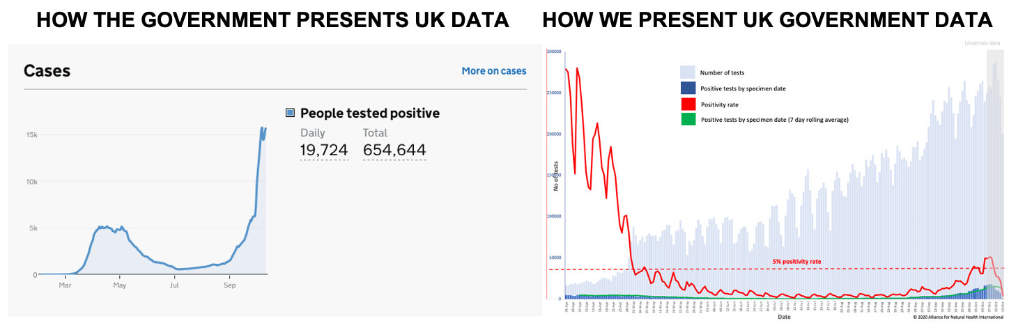
UK ‘case’ data
The UK government is implementing more lockdowns based on rising ‘case’ rates. Once again, the devil is in the detail. The government has chosen to report case data in two ways. One is by specimen date (the date a test is undertaken), the other by reported date. Needless to say, there is a significant difference between the two. The ‘reported by date’ data show ongoing high levels of cases, while the ‘specimen date’ data reveal a different story entirely. First of increasing, then of declining numbers of cases. The government and media appear to be highlighting the number of cases by reported date in order to drive fear or compliance among the general public and justify the ramping up of restrictions.
Professor Carl Heneghan from the Centre for Evidence Based medicine suggests we should rely on the ‘specimen date’ data.
Which data set do you want to rely on?
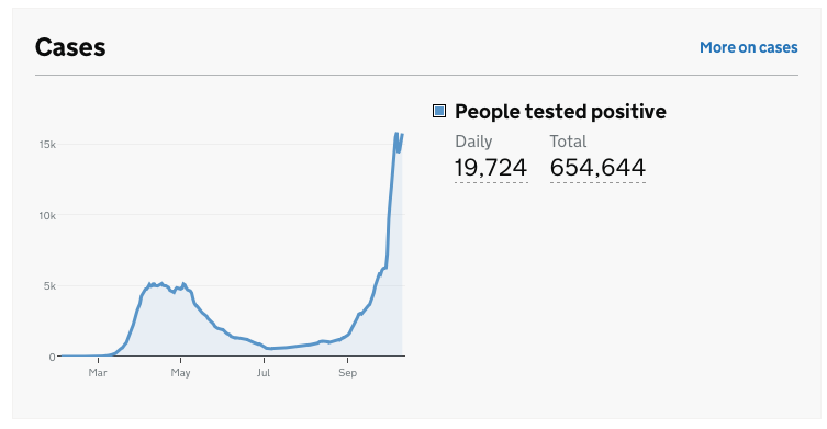
Figure 2A. UK Government Covid-19 dashboard summary showing a snapshot of daily cases by reporting date, the government’s preferred reporting measure
Source and presentation of data: UK Government Covid-19 dashboard
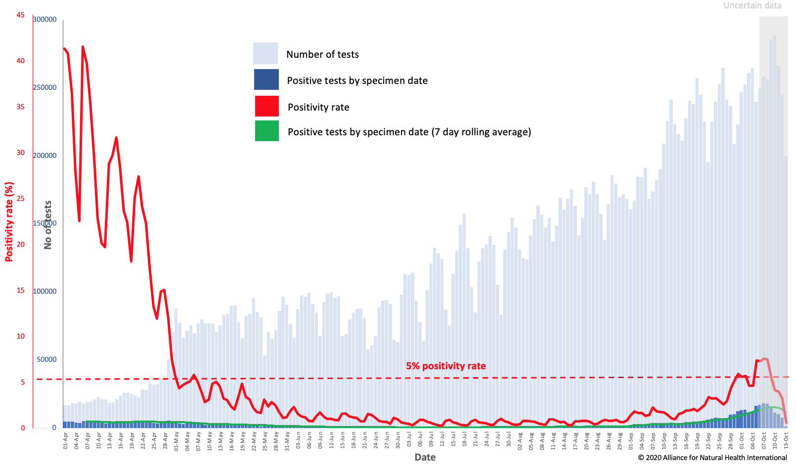
Figure 2B. Number of daily cases by specimen date against number of pillar 1 & 2 daily tests as at 13/10/20. Positivity rate = the ratio (as a percentage) of positive tests among those tested each day. The 5% positivity rate threshold is marked because on 12 May 2020, the World Health Organization advised governments that positivity rates should be 5% or less for 14 days before easing lockdowns.
Source data: UK Government Covid-19 dashboard. Presentation of data by ANH-Intl.
When you take our view of UK government data (Fig 2B), you see something a little different to that which is presented by the government itself (Fig. 2A). Which version of the presentation induces more fear, and appears to provide stronger justification for lockdown? Either way, the longer-term trend will of course be critical and the dip that is apparent in Fig 2B may be linked to the greater uncertainty of the most recent data.
Nonetheless, it is our view, and the view of many others including the scientists and doctors supporting the Great Barrington Declaration, that restrictive measures like lockdown should be made on the basis of risks of severe disease, hospitalisation capacity, availability and success or otherwise of therapeutic measures – and mortality rates (especially excess mortality).
Currently, of the 24 participating European EuroMOMO countries, only Spain, Belgium and the Netherlands are experiencing any excess mortality – and the level in these three countries is currently deemed low.
Do you consider yourself to be anti-science or a conspiracy theorist if you don’t go along with the prevailing government view to re-invigorate lockdown measures?
Is Covid really worse than pneumonia and flu?
Recent reporting in the UK media is a classic example of cherry picking and unbalanced journalism. It relies, once again, on using very specific data sets that appear set to get people to push the panic button. Things can look somewhat different if you use another set of official data. Are you sensing there’s a theme here?
Figure 3A is the BBC’s presentation of Office for National Statistics (ONS) data that’s being widely disseminated to rubbish anyone, scientists and doctors included, who say Covid is on par with a typical bad flu season.
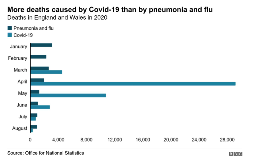
Figure 3A. Covid-19 mortality in England and Wales compared with that from non-Covid pneumonia and influenza.
Source and presentation of data: BBC News
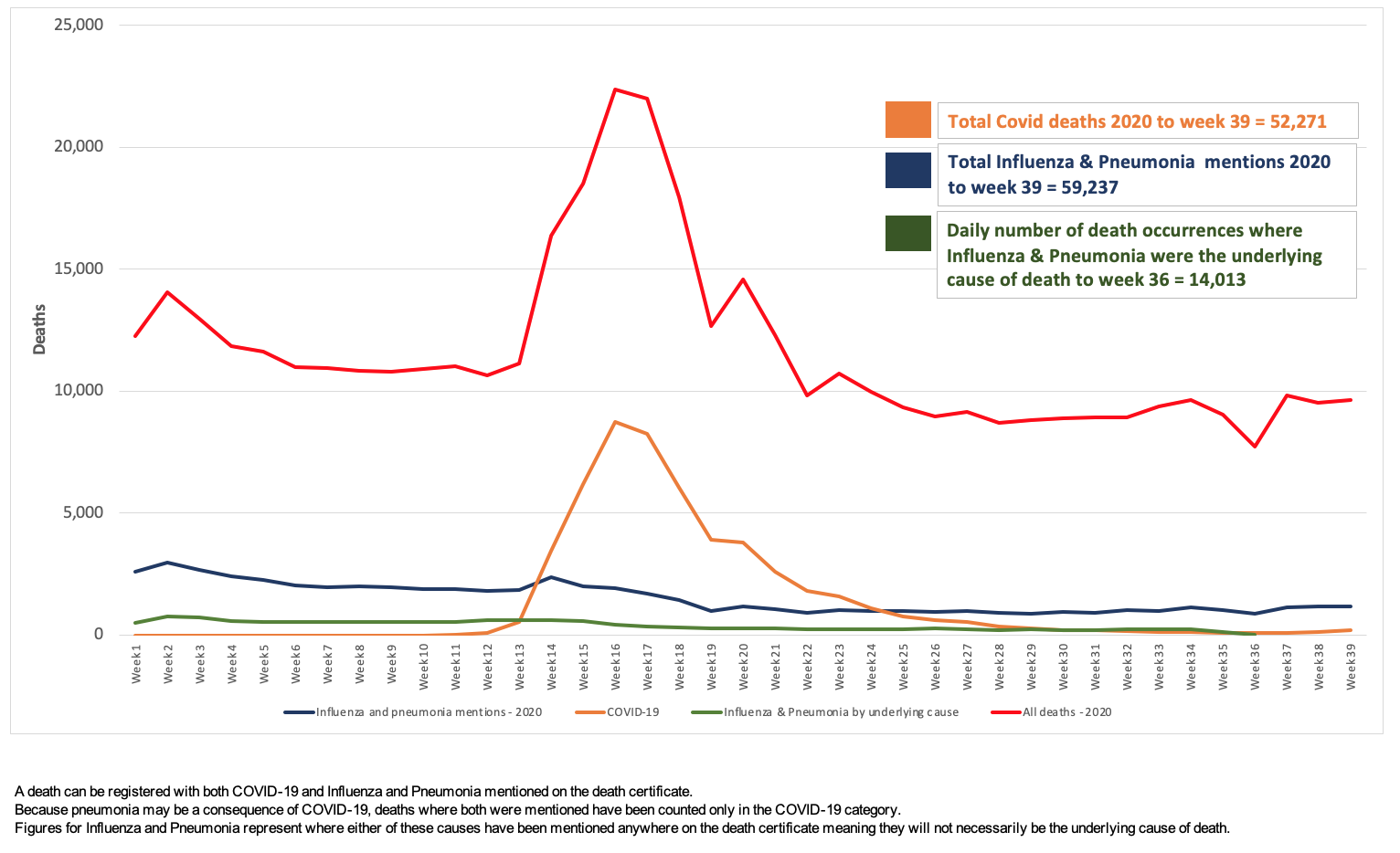
Figure 3B. Total mortality (red line) and Covid-19 mortality (orange line) in England and Wales, compared with deaths from non-Covid pneumonia and influenza (‘mentions’ = blue line; ‘underlying cause’ = green line).
Source of data: Office for National Statistics. Presentation of data: ANH-Intl.
We’ve gone and dug out the original ONS data and plotted it directly – as shown in Fig 3B. The spike during the main surge of Covid in April and May is apparent, but thereafter, Covid-related deaths have been tracking substantially beneath those of non-Covid pneumonia and influenza.
Similarly, in the US, headlines trumpet the deadliness of the coronavirus but downplay the number of deaths related to flu and pneumonia.
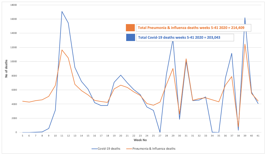
Figure 4. Pneumonia & Influenza and Covid deaths weeks 5 to 41 2020
Source data: Centers for Disease Control and Prevention. Presentation of data: ANH-Intl.
Do you note the close association between peaks and troughs in both diseases – does this suggest they may be some conflation between Covid-19 and other respiratory diseases?
Time to scratch our heads – and look in the toilet bowl
Is it any wonder the general public are losing faith in their leaders and their advisors along with their policies and increasingly distrust the science being used to justify said policies?
Let’s just throw one additional piece of scientific information into the mix. There is a rapidly growing body of evidence to show that many parts of our environment test positive for SARS-CoV-2, the virus that causes Covid-19. Especially the sewerage and wastewater systems where human waste ends up being treated and recycled.
All that means is that the specific genetic sequences that are targeted by different RT-PCR testing systems have shown up, or there has been an error (a false positive), the likelihood of which will be much higher and can exceed 90% of all tests when prevalence of the real virus is low.
If you find the sequence that the PCR system uses (different ones amplify different regions of SARS-CoV-2) – bingo – you’ll get a positive result. But that doesn’t mean you’re dealing with a potentially infectious virus, because you could simply have amplified viral remnants or waste. And there’s an awful lot of that in sewage systems, and there is likely a lot of it elsewhere.
So when we were alerted about a video by a young vlogger-cum-citizen-scientist, our interest was piqued. Read on and see the video below!
When confused, turn to citizen science!
With all the contradictions and changes in official Covid science, and more and more voices, despite all the censorship, claiming differing degrees of foul play, it’s inevitable that some citizens will go out to test a few of their hypotheses themselves.
We found the following YouTube video from a young Vlogger – Jordan Houston – who has over 1 million followers. Being perfectly healthy but having increasing doubts over the reliability of the PCR tests being used, he decided to test his dog, keyboard and the pavement. Two out of three of them came back positive. See the video and find out which two! This is citizen science within a topsy-turvy world in action!
And they wonder why more and more of us distrust official Covid science?
Find out more at ANH-Intl Covid-19 Adapt Don’t Fight campaign


Comments
your voice counts
17 October 2020 at 3:12 pm
He wasn't exactly careful with the swabs - leaving one lying on the desk, touching another with his fingers after taking it out of the packet...not very scientific!
22 October 2020 at 7:08 pm
And it seems that the testing isn't very scientific either. And at no point did he claim it was a scientific test. So I'd always advise a large pinch of salt with anything "scientific", science is nothing special, it is meant to be a method for testing theories, proving (or not) things and is highly corruptible.
17 October 2020 at 3:20 pm
This young man had me roaring with laughter with his experiment. It just goes to show what a farce this testing is. Well done Jordan. You should get a citizen award .
17 October 2020 at 5:19 pm
I especially enjoyed the dog sampling — brilliant!
18 October 2020 at 10:39 am
Very good and balanced article. I will spread it in the local community groups which mainly consists of ardent mask wearers.
However, I would have welcomed if the stat that talks about "specimen dates" could have been explained in layman language. I have no idea what this actually means.
18 October 2020 at 1:55 pm
Hi Kent
It's good to hear you found the article useful. Thank you for sharing it with your networks.
In answer to your question, specimen date is the date a test was undertaken. Reporting date is the date the result of the test is reported. Prof Carl Heneghan recommends the use of specimen date "Because the actual test could have occurred some time before (symptoms could be even earlier) as opposed to the date of reporting, which can fluctuate due to delays in reporting. This is a similar problem to delays in the reporting of deaths that led to changes in the way they are reported." in his recent piece in The Spectator - https://www.spectator.co.uk/article/the-rule-of-four-how-to-make-sense-of-covid-case-numbers.
I hope this helps.
Warm regards
Melissa
18 October 2020 at 8:06 pm
So glad you have found some more recent studies into mask wearing, besides all my scepticism at the start, I have been a good girl and warn mine. I came at it from the angle of it possibly having a placebo effect -helping to reduce stress and anxiety in others and so support their immune system that way. The current case rates (Though I am totally in line with the delightful Jordan in the above video!), hospitalisation rates and Government reactions seem to indicate mask wearing is at best having no effect at all, I have been perplexed as to why this wasn’t being talked about more! Hopefully there will be more debate and some proper science at some point. Thank you again for finding this.
22 October 2020 at 5:55 pm
Ahhhh mask wearing, enough of the nonsense I say! A number of eminent Surgeons have appeared on camera recently stating they are 'obliged' to wear a mask in the operating theatre to give the appearance of being a 'professional' doctor. In reality, they claim that masks provide little if any protection either for them or the patient. We live in a world where the truth is often suffocated or ignored.
22 October 2020 at 7:13 pm
Face shields... mask or visor or both simultaneously?
A friend recently tested positive (she had symptoms as well), she's a therapist, has to wear both a visor and mask whilst working, follows all current guidelines, in fact is extra careful so goes further than guidelines. Her last client of the week called to say she had tested positive and following due diligence suggested my friend had a test.
Conclusion... face coverings do not work. Yes not a scientific statement, just a blinking obvious observation. If face covering worked the case rate would not be climbing like it is. #projectfear
03 November 2020 at 11:15 pm
I used to do contamination compliance measurements in cleanrooms as an engineer for a nanotech company. Viruses can't even be stopped in cleanrooms, never mind with a simple mask. Viruses are way way smaller than people realize (100nm), they stay suspended in the air column and adhere to surfaces electrostatically. They will pass through even a HEPA filter in a cleanroom. Masks are nothing more than a placebo for scared scientifically illiterate idiots.
Your voice counts
We welcome your comments and are very interested in your point of view, but we ask that you keep them relevant to the article, that they be civil and without commercial links. All comments are moderated prior to being published. We reserve the right to edit or not publish comments that we consider abusive or offensive.
There is extra content here from a third party provider. You will be unable to see this content unless you agree to allow Content Cookies. Cookie Preferences